{kind=image/jpg}
We talk a lot about header improvements because they're often the first thing someone looks at when they land on your website. If the header is not designed with search engine optimization (SEO) and content marketing best practices in mind, odds are good that site users will bounce right back to their search results.
Adding a Contact or Free Quote button in your header that takes users directly to a lead capture form is an excellent improvement to website design and development. It also makes things easier for the user.
By taking them directly to a lead form that's a bit further down the page, instead of to a separate page where they have to locate the lead form, you're removing a step and getting them closer to products and services they can use.
Here's how clients of our digital marketing agency make the most of this feature.
Make it Sticky and Mobile-Friendly
Sticky headers and header features mean they're visible on every page and that they remain "above the fold." No matter where someone is on your website, their path to a lead form or "contact us" message will be in a "prime real estate" area of your website.
Your content management system (CMS) might have features that allow you to activate this site-wide. If not, your developer can hard code it, or you may be able to use a plugin. Just remember to keep it mobile-friendly; that's a ranking factor for SEO and keeps your site accessible to the majority of your potential customers.
Make it Appealing and Personable
You want a site user's eye to be drawn to the area where they need to take action. Color is an easy way to do this. We suggest:
Using brand colors from your style guide
Selecting a color that contrasts with the rest of the header.
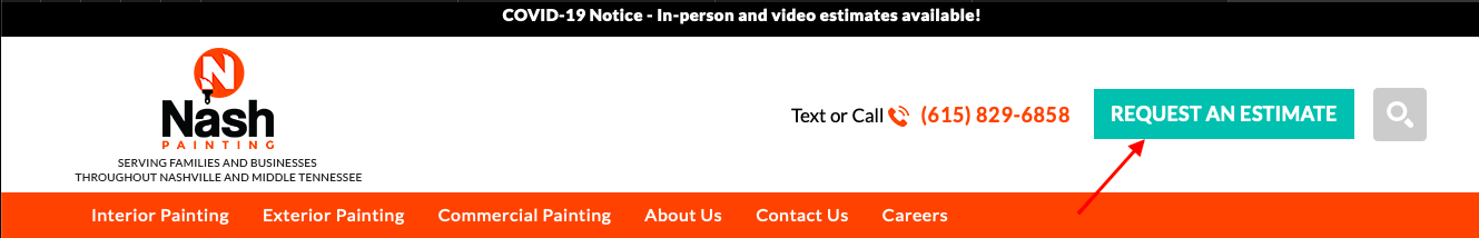
The clickable header button on Nash Painting's website is in a contrasting color, with action-oriented copy.
Wording is important, too. Content marketing is about more than long-form blog posts and white papers. The "micro-copy" for buttons and other calls to action can make the difference between a lead and a passerby. Here are some tips for developing this:
Keep it friendly.
Use words you would use as a real person with a real person
Avoid bland wording like "Send Message" or words that may have a negative connotation, like "Submit."
Instead, try "Talk to Us," "Get Your Free Quote," "Get Started," or something else energizing and motivating.
Another Idea: Modals
Modals are pop-ups that show a lead form briefly after the user has been on the site for a specific amount of time. Rather than replacing a link to a form in your header, a modal provides an extra boost. Modals are ideal for special offers, to bring attention to a new area of your site, or to direct people to a specific team member. You can also connect your modal to your marketing analytics tools to check how it’s impacting results.
Test Any Changes
We always recommend testing website changes and edits, even those designed for SEO. If there are problems, changing the size of icons, buttons, and related images might help. It's also a good idea to monitor any plugins connected with your lead forms so that you can make adjustments if pagespeed slows down after linking a button to a form elsewhere on the page.


